
This article in the Washington Post presents 40 maps that explain the world. They are all interesting and easy to digest. The three maps below are examples which illustrate key issues the world grapples with now.
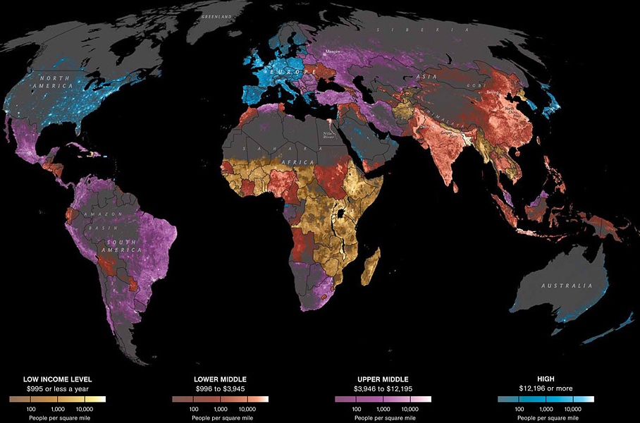
This map shows where the wealth is. It shows national wealth and density of people, but not individual income.
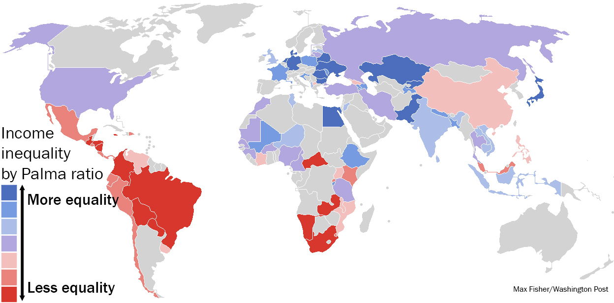
This map shows income inequality.
And this one shows what countries would look like if (when) polar ice caps melt. National Geographic’s wonderful, full interactive is here.
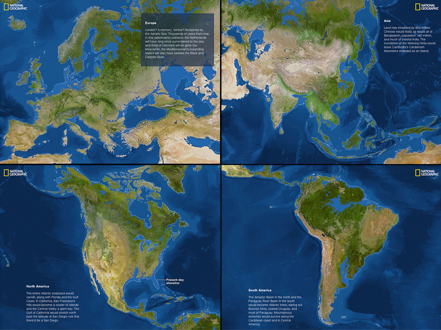
And in case you are sceptical about the chance of that happening, here are scientific references to support the case that sea levels are rising.
Washington Post: 40 more maps that explain the world
Comments